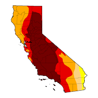
The drought in California has been going on for a few years now, and the talk of an El Niño winter bringing much needed relief makes me wonder about the latest state of the drought situation as we move through a hopefully wet winter. Surprisingly, I was hard-pressed to find good, up-to-date sources of California drought conditions data that show changes over time.
For starters, the United States Drought Monitor provides great percentile data for different drought level intensities, updated on a weekly basis. However, the tables do a poor job of depicting the progression of the drought conditions on a weekly basis, even though that data is readily available and dates all the way back to 2000. The best visualization of this data that I’ve found, in time-series form, is the graph from the US Drought Monitor that almost gets the job done but lacks some fine grained control. So, I made a slightly tweaked version of this graph that is hopefully a solid dashboard that can serve as an up-to-date summary of drought conditions. The graph can be easily manipulated for comparisons over different time periods, and always loads the latest data from the aforementioned sources.
October 2016 Update: Unfortunately, California is still in a drought and some of the aforementioned links and data sources no longer work. Nevertheless, the code used to generate the custom dashboard is reproduced here (requires Google Charts and jQuery):
$(document).ready(function() {
    var yearsAgo = 5;

    var parseDate = function(str) {
        var date = Date.parse(str.substring(0, 4) + "-" +
                              str.substring(4, 6) + "-" +
                              str.substring(6, 8));
        return new Date(date);
    };

    var graph = function(raw) {
        var columns = ["Exceptional", "Extreme", "Severe", "Moderate", "Abnormal"];
        var colors = ["#730000", "#E60000", "#FFAA00", "#FCD37F", "#FFFF00"];

        var data = new google.visualization.DataTable();
        data.addColumn('date', 'Date');
        columns.forEach(function(col) { data.addColumn("number", col); });
        data.addRows(raw.map(function(row) {
            return Array.of(parseDate(row[0])).concat(row.slice(1).map(parseFloat));
        }));

        var latest = parseDate(raw[raw.length-1][0]);
        var chart = new google.visualization.AnnotationChart(document.getElementById("graph"));
        var options = {
            displayAnnotations: false,
            displayZoomButtons: false,
            colors: ["#730000", "#E60000", "#FFAA00", "#FCD37F", "#FFFF00"],
            fill: 40,
            legendPosition: 'newRow',
            min: 0,
            max: 100,
            thickness: 2,
            zoomStartTime: new Date(latest.getTime() - yearsAgo*365*24*60*60*1000)
        };
        chart.draw(data, options);
    };

    var updateTimestamp = function(raw) {
        var text = $('#updated').text();
        text += parseDate(raw[raw.length-1][0]);
        $('#updated').text(text);
        $('#updated').show();
    };

    var init = function() {
        $.get("http://www.drought.gov/dcpaws/data/CA/d0,d1,d2,d3,d4", function(data) {
            data = data.replace(/(^.*values\>|\<\/values.*$)/g, "")
                .trim()
                .split("\n")
                .map(function(line) {
                    return line.split(/,\s+/);
                });
            updateTimestamp(data);
            graph(data);
        });
    };

    google.load('visualization', '1.0', {'packages':['annotationchart']});
    google.setOnLoadCallback(init);
});

Comments